There’s a wide variety of fonts available, but how do you choose the best one for your website?
It’s essential to pay attention to details, and selecting the right typography for your site is just as important as choosing the images and text. The combination of all these elements is key to creating a flawless web design.
Keep in mind that your font choice can influence the message you convey to your visitors. The right font can make your website look professional, while a poor choice can have the opposite effect.
Step One: define the message you want to communicate
When designing a website, it’s crucial to have a clear understanding of what you want to communicate to visitors. An effective message can evoke emotions and sensations that connect with your audience and encourage them to explore your content further.
It’s essential to define your business identity and the values you want to highlight. A good way to start is by selecting three or four keywords that define your business and building a consistent, solid message around them. Ultimately, the goal is to create an engaging and memorable user experience that leaves a lasting, positive impression on your visitors.
Font families
There are many fonts available, which can be grouped into different families. Some of the main ones are:
✦ Serif fonts
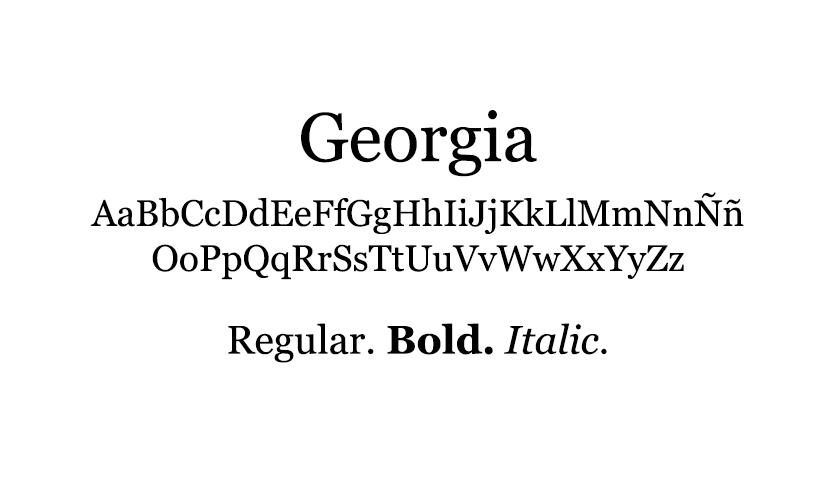
Serif fonts have small decorative strokes at the ends of their characters. Considered some of the earliest fonts used in design, they are highly readable and commonly used for corporate text and headlines. They’re also ideal for targeting an older audience because of their classic and elegant appearance.
Some of the most popular serif fonts include Times, Georgia, Garamond, and Courier.

✦ Sans Serif fonts
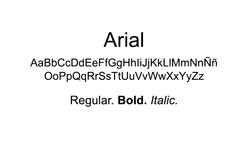
Sans Serif fonts are characterized by the absence of decorative strokes at the ends of their characters, unlike Serif fonts. They are ideal for digital screens, as their simpler design makes reading easier on electronic devices. These fonts are perfect for projects that require a modern look, clear readability on digital devices, and a minimalist approach.
Some of the most popular Sans Serif fonts include Helvetica, Avant Garde, Arial, and Geneva.

✦ Handwritten fonts
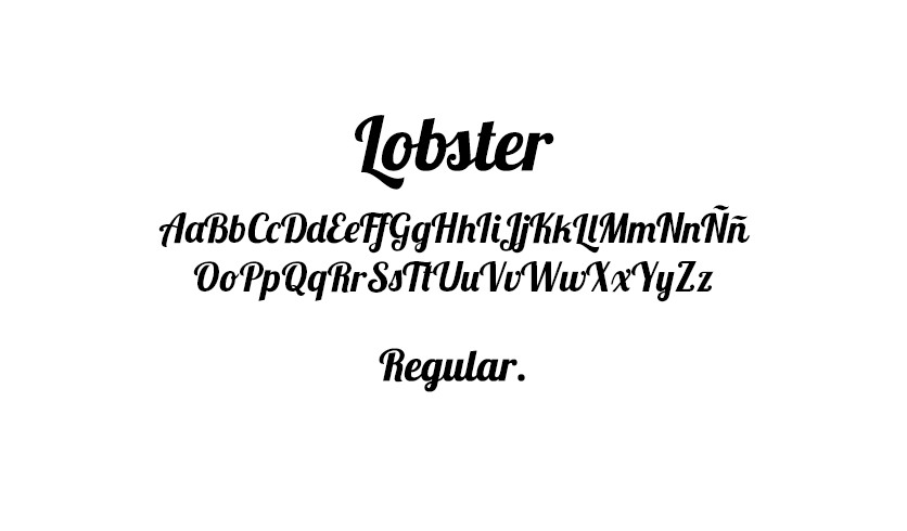
Also known as script fonts, these typefaces mimic the appearance of handwriting. They are generally used to add a personal and authentic touch to designs, conveying warmth and a sense of closeness.
It’s important to note that handwritten fonts can be more difficult to read compared to other fonts, especially at small sizes or in large blocks of text. Therefore, it’s recommended to use them in designs with less text, where you can play with size and placement to maximize their impact.
Some of the most popular handwritten fonts include Brush Script, Pacifico, Lobster, and Alex Brush.

These are the three main groups into which fonts are divided, although there are countless other fonts that can be categorized further. Among them, you’ll find the perfect font for your website.
It’s important to remember that less is more: I do not recommend using more than three different fonts in a single project. Using too many fonts on a website can disrupt visual hierarchy, making your content confusing and cluttered. It’s better to keep it simple and carefully choose the fonts that best suit your design needs.
What to keep in mind when vhoosing the perfect font for your website
There are many websites where you can download fonts for free. However, if you want to use a font on your website, it’s recommended to choose one from Google Fonts to ensure it displays correctly across all browsers. Additionally, there are several other considerations to keep in mind:
✦ Legibility
This is one of the most important factors when choosing a font for a web project. The font should be easy to read and understand, even at small sizes or on low-resolution screens.
Keep in mind that legibility can also depend on context. For example, a font that works well for a heading may not be suitable for longer body text. That’s why it’s important to test the font in different sizes and contexts before deciding to use it on a website.
✦ Compatibility
The font must be compatible with the most popular web browsers and operating systems to ensure it displays correctly on different devices.
There are several ways to check font compatibility across browsers and operating systems. One option is to use online tools like BrowserStack or CrossBrowserTesting.
✦ Style
The selected font should align with the overall style of the website, including design, color palette, and content tone. For example, a fashion brand website might benefit from an elegant and sophisticated font, while a sports website might use a bolder, more energetic font.
✦ Font Harmony
Fonts should be used to establish a visual hierarchy, making sure the most important elements stand out clearly. Choosing fonts that complement each other can improve readability and overall visual cohesion.
✦ Size and Weight
When selecting a font for your website, consider both size and weight carefully. Font size is crucial for readability, ensuring visitors can comfortably read the text. Fonts that are too small can be difficult to read, especially on mobile devices or low-resolution screens.
Font weight refers to the thickness of the characters. Heavier weights can emphasize certain words or phrases, but overusing bold fonts can reduce readability and make content look messy or confusing.
At Unika Estudio, I understand the importance of choosing the perfect fonts, along with all the other elements that contribute to web design, to achieve an exceptional final result that accurately conveys your brand’s message.
So, if you’re looking for a professional web designer who cares about the details and can help you create a high-quality website, don’t hesitate to get in touch.
Designed with ♥ by Unika Estudio | © 2020-2025 All rights reserved.


